четвъртък, 26 юни 2008 г.

the birds, bats and bees


TOMOKO AZUMI

Set of three bee hives, 2008
Phillips catalogues. Not suitable for outdoor usage. Diameter: (i) 26 cm. (10 1/4 in). (ii) 19 cm. (7 1/2 in). (iii) 17 cm. ( 3/4 in).


SIR PAUL SMITH

Bird house, 2008
Wooden cable and paper. 40 x 30 x 20 cm. (15 3/4 x 11 7/8 x 7 7/8 in).


TOMOKO AZUMI

Bird house, 2008
Phillips catalogues. Not suitable for outdoor usage. Diameter: 16cm (6 1/4 in). 14cm. (5 1/2 in). 10cm. (3 7/8 in).

all

http://www.phillipsdepury.com/

Belenko interior lamp


Lamp

Idea: Denis Belenko
Model: Dmitriy Nkolaenko

събота, 21 юни 2008 г.

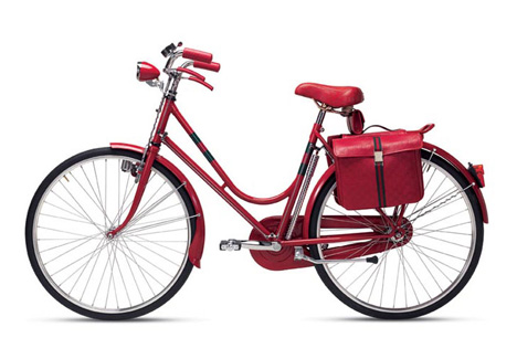
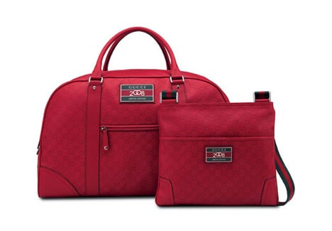
Gucci takes a bike trip to fashion Hell


Posted by Anthony James in All Archive, Fashion
June 20, 2008 11:00 am,
Oh Tom Ford, where are you when the world needs you most? I am sure he is turning over in his $98,000 sheets and just woke up from a nightmare where he saw the luxury empire he masterfully helped re-create crumbling all around him into a tacky abyss. Take a look at this pandering disaster a certain Miss Frida Giannini, creative director at Gucci, has let get past the gates of hell. Gucci is somehow “proud” to announce the Special (as in retarded) Collection dubbed “8-8-2008 Limited Edition” to commemorate the 2008 Olympic games. And if by “limited” let’s all hope it’s limited to just these pictures. It would seem that Miss Giannini pretty much tackled some Harajuku girl and stole all her possessions, dipped them in red paint and stuck Gucci logos on them. What, no mobile phone trinkets? Tom, please come back and lay a smack down on this situation before it’s too late.

Orange Crush Fashion Trends


Photographer: Bode Helm; Model: Hasmik Shaw/Kim Dawson Agency; Hair & makeup: Sara Domi/Kim Dawson Agency; Stylist: Stephanie Quadri; Prop stylist: Molly Terry; Assistant: Holly Bauman

Color is bold this season in both fashion and home design. Local shops offer a plethora of wares to bring this trend to life in your wardrobe or your living room. Make shades of orange pop by pairing them with vivid blue accents.

Hasmik is wearing an Oscar de la Renta dress ($4,250/Oscar de la Renta NorthPark) with Theory top ($180/Neiman Marcus Downtown), Melissa rubber wedge ($86/Forty Five Ten), and Lymography camera ($38/Urban Outfitters). Products (clockwise from top left): Kartell “fly” light ($266) and Kartell “toobe” floor lamp ($606), both available at Lights Fantastic; Balenciaga “City” bag ($1,595/Barneys New York); coat rack ($68/Urban Outfitters); ceramic owl ($12/House of Dang); cashmere throw ($695/Barneys New York); Prada hobo ($1,195/Neiman Marcus Downtown); felt bird frame ($10/Nasher Sculpture Center); ceramic stool ($177/Jones Walker); Bungalow 5 orange stool ($212), felt bird frame ($10), iitala Oiva Toikka glass bird ($205), all available at Nasher Sculpture Center; Kartell “Tris” table ($762 set of three/Lights Fantastic); jersey knit shag rug ($10/Urban Outfitters); Jordan McMillan pillow ($70), Bornagain by David Goltl pillows ($69 & $49), mango wood vase ($253), all available at Jones Walker; orange orchids ($8 per stem/Pier 1); Bouroullec Brothers “Facet” armchair ($2,685/Ligne Roset); Taschen books ($250 each/Barneys New York); Michael Kors “Sutton” clutch ($495) and Christian Louboutin shoes ($650), both available at Neiman Marcus Downtown; Ane Christensen “dented bowl” ($925/Nasher Sculpture Center); Armand Diradourian pillow ($195/Barneys New York); Kartell “La Marie” chair ($288/Lights Fantastic).

понеделник, 16 юни 2008 г.

Chanel Arrives At Dover Street Market


Chanel has arrived at Dover Street Market with an ephemeral boutique on five of the six floors, showcasing an edited selection of Ready to Wear, accessories, and shoes from the unique Metiers d'Arts Paris-Londres Collection.

This is the first time that Chanel will be available at Dover Street Market and will feature limited edition pieces, in addition to a selection of iconic pieces from the Chanel collection. From 9th to 25th June.

Luis Eslava’s use of Velcro-


http://www.luiseslava.com/

петък, 13 юни 2008 г.

1.PopMat Paper Placemat
2.PopMat Birdcage Placemat in White Sand / PM301-wh
3.PopMat Tree Placemat in White Sand / PM303-wh


http://www.publiqueliving.com/popmat.html

неделя, 8 юни 2008 г.

aurélie mathigot


aurélie mathigot

Joshua Gajownik and Yatzer

понеделник, 2 юни 2008 г.

Karim Rashid - отново

Маса от Corian


Karim Rashid has created The Endless Nile table for Amr Helmy Designs.

A consortium of Egyptian interior design companies, including Amr Helmy Designs, came together to form the Design Republic of Egypt brand, intending to develop interior solutions combining Egyptian creativity with international design trends.

This new design, while inspired by the past, deconstructs conventional table and seating concepts to recombine them in an original and contemporary solution.

The Endless Nile table is inspired by the slow and perpetual flow of the Nile river.
Having a wooden base with a steel structure, the white Dupont Corian brings fluidity into the design and clearifies the lines and its structure.

Dimensions: (l x w x h): 210 x 180 x 78 cm.

Restyled bakery in Milan


The Callegaro bread shop in Milan features different zones to satisfy different requirements.

The bread zone where one can buy not only bread but also focaccia, pastries and dishes. This long-stretched counter shows simple lines with a wide window that gives a clear view on all the oven products.

For breakfast, aperitifs, coffee and cocktails, one can take a seat at the glossy white bar counter.

And last but not least, to relax and meet with others there is the relax room.

The restyling, done by Costa Group, includes the red tiles on the floor, the wooden walls with pipes, mirrors, sofas and the lighting. On request of the bakery owners, they gave the shop a lively appearance for every occasion and daytime.

Goodbye Yves Saint-Laurent...

MGH2O boutique


The MGH2O boutique in Rotterdam by Richard Hutten may be constructed to appear casual to the core, but the merchandise is very much haute couture.

Margreeth Olsthoorn started out with a shop stocked with second-hand furniture, to which she eventually added second-hand clothes. After deciding to sell new apparel as well, she dropped the furniture to concentrate solely on fashions. Three years after Richard Hutten gave Olsthoorn’s Rotterdam boutique a face-lift, helping her to build up a clientele of regular customers, she felt it was time to separate the sexes. Menswear would take leave of the ladies and Hutten – now the love of her life – would step in and design a retail interior for the new shop: MGH2O. Point of departure? ‘Men,’ says the designer.

It’s not a theme you’d immediately suspect when confronted with the palette of the interior. Located on a street corner in Rotterdam, the little shop is a healthy skin-pink from floor to ceiling. The security gate at the entrance, the record player in the window, extension cords on the floor – not a single detail has escaped the pink emulsion. Only the counter is baby blue. ‘Margreeth really wanted a flesh colour, which wasn’t a bad idea. Theoretically, whatever shade you choose has to complement the clothes. If it doesn’t, you’ve got a problem.’

Hutten brought in a team of construction workers and began tearing down walls and carving up the floor of the tiny spirits shop that formerly occupied these premises, adding the space previously used for storing bottles to the retail area of the new boutique. He covered the bare walls with chipboard, but everything he’d gathered from behind the walls – tiles, rails, a tap – was left as is, and everything still needed for the store – stairs, counter, display units – was sawed, hammered and assembled on site or in his studio. The result can be described as ‘clumsy carpentry out of square’. ‘All that work and not one drawing,’ he says. ‘It was more like making sculpture. The idea was to create a space that would look as though a bunch of construction workers just knocked the thing together.’ It’s an idea that’s visible everywhere you look.

‘No sign of design’ – Hutten’s motto from the 1990s – has been back on the scene for some time now in the guise of ‘super normal’, a similar slogan associated with Jasper Morrison, among others. ‘This interior is also “no sign of design”, but here it’s got a frayed edge. Those “super normal” people are all about making slickly finished, ultra-anonymous products. This is more rock and roll, wouldn’t you say?’ Hutten points out that even though you can’t spot any blatant examples of design at first glance, the interior does reveal several solutions that relate to design. A sturdy framework reinforces the Styrofoam counter, for instance, and upstairs a balustrade doubles as a table.

Because Hutten designs everything that goes into an interior, as well as the interior itself, these projects take a lot of time. To work on more than one interior simultaneously, he’d have to bulk up his five-man rock band, an idea that doesn’t interest him. ‘It’s product design that I like most. The nice thing about interiors is that I get the opportunity to develop new, site-specific products.’
A preference for product design doesn’t mean that Hutten didn’t have fun making MGH2O. ‘Walking into that incredibly dull fitting room downstairs [a sort of super-low slalom with no curtain and PVC tubing for hanging clothes] always makes me chuckle – the very thought that this is interior design!’

Words Femke de Wild
Photos Daniel Nicolas

NWE theatre


Situated in the southern part of the Netherlands, Maurice Mentjens designed the ground floor of the NWE theatre in Tilburg.

The historical building in which the theatre is situated inspired Maurice to choose the concept of modern baroque, where each space has its own colour.

The theatre café is divided into two sections, one black and one white, connected to each other by big openings. To create another correlation, the striking bar and the bottle racks are, except from their colour, the same in both areas.

Separated from the white section by huge panel doors is the red salon, which houses the restaurant. According to Mentjens, the colour red ensures warmth and appetite. Placed in the centre of the restaurant is a golden ball that gives the space a warm glow, just like the sun.

On the other side of the white salon is the greenhouse with two walls of glass and concrete flooring. The other walls are furnished with soundreducing panels with a digital motif of plants and flowers.

HACKENBROICH ARCHITECTS SHOP


Berlin-based Hackenbroich Architects just finished a hairdressing shop in Cologne.

The light installation has become a main spatial feature in the hairdressing shop in Cologne called Haarwerk. Seventy-five lamps emerge from a central point of the space and reach out into the room. The lights can be controlled and dimmed in five circles to allow a smooth transition of various illuminated conditions.

Here’s some information from the architects themselves:
“The overall organization of the store was challenged by the spatial limitation of the old factory building. To maintain a coherent spatial experience while accommodating all functional areas, we decided to extrude the enclosed functional areas from the back-wall.

The materials fluctuate between a refined and rough appearance. While the wallpaper has a subtle elegance the lamps have an industrial quality. The colours articulate the volumetric logic by continuing the dark grey of the floor or the ginger marking the sidewalls of the store. The lights, when partially dimmed, combine the white of the wallpaper, the ginger of the wall and the dark grey of the floor.”

Pizzeria in Sicily


Francesco Moncada designed the interior of the Perez pizzeria in Sicily.

The Italian-based designer used graphics, made in collaboration with Point Supreme, to express the variety and richness of taste in the food served there. All ingredients are mapped and symbolized by colours and codes, mingled in a matrix placed on one of the walls. The combinations result in different pizzas.

On the wall next to the entrance appears a real size zebra. The zebra is the opposite of the matrix; colourless and simple in its appearance.

All the furniture, except the Kartell chairs, is designed by Francesco Moncada himself, exclusively for the restaurant.

Photos Alberto Moncada

Bangalore Express


Bangalore Express serves fast, Indian street food and the client wanted a modern and fresh environment to match.

After stripping the space back to its shell, they added a pattern of linear cuts to the interior wall cladding. This was done on site using a circular saw to cut shallow grooves.

The cladding was then painted one solid colour, after which some of the shapes created by the grooves were painted in a strict palette of three contrasting colours. The resulting composition of shapes and colours guides the customer’s eyes around the space in a controlled way.

The inspiration for this cladding treatment came from the waste boards on which builders cut sheet materials to size. After a while, an arbitrary patter of random shallow grooves adorn the surface of a waste board on which many sheets have been cut.

Much of the furniture is constructed from FastClamp, galvanised steel tubes and fixings normally used to build scaffolding. Diners climb step ladders made of these scaffolding tubes to access the upper-level booths that line one side of the restaurant. This gives the restaurant a hard edge and introduces the desired urban aspect to the interior, a fitting ambiance for street food.

Words Billy Nolan
Photos Philip Vile